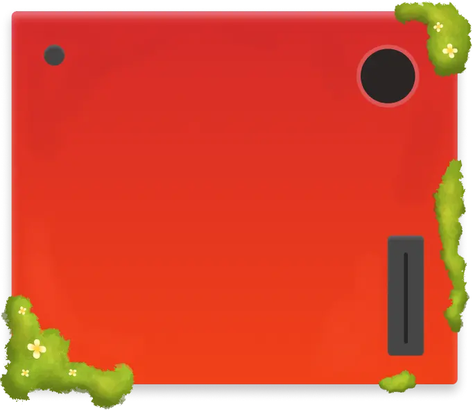
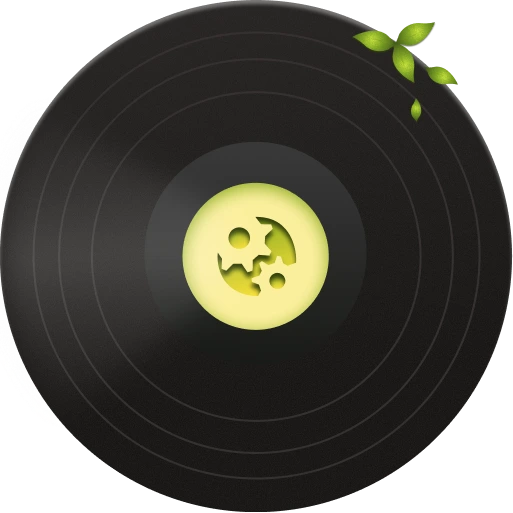

vinyl player code credit: ching lam lau (HTN dev team)
Overview
How do you translate an evolving creative direction into a cohesive digital experience?
TL;DR
Every year, Hack the North starts over. A new theme. A new visual world.
For 2026, I helped translate that world into a digital experience across the teaser site, main website, and design system behind it all. My work focused on defining what the experience should be, how it should behave, and how all of its pieces should fit together, from the first teaser interaction to the easter eggs within the main static site.
This included:
- Leading the concept and interaction direction for the teaser site
- Defining visual language and interactive mechanics across the web experience
- Designing the Hero, About, Job Opportunities, Sponsors, FAQ, and Thank You Experiences in the static site
- Designing interactive systems for the vinyl, game boy, cassettes, job boards, notebooks, and audio experiences
- Creating components including buttons, text input fields, accordions, etc. for the 2026 Hack the North Design System
Visit the Live Sites
The Problem
Starting with a blank slate
Hack the North gets a new theme every year, which means the website has a unique challenge: It has to make people care before they know what they’re looking at. The site isn’t just where you find application information. It’s often someone’s first encounter with the Hack the North identity. That made the design problem less about “How do we organize this information?” and more about:
How do we make the theme feel alive?
I approached the site as a digital extension of the year’s creative direction, thinking about not just what users would see, but what they could click, drag, listen to, discover, and play with.
Product 01: Teaser Site
Building curiosity before giving anything away
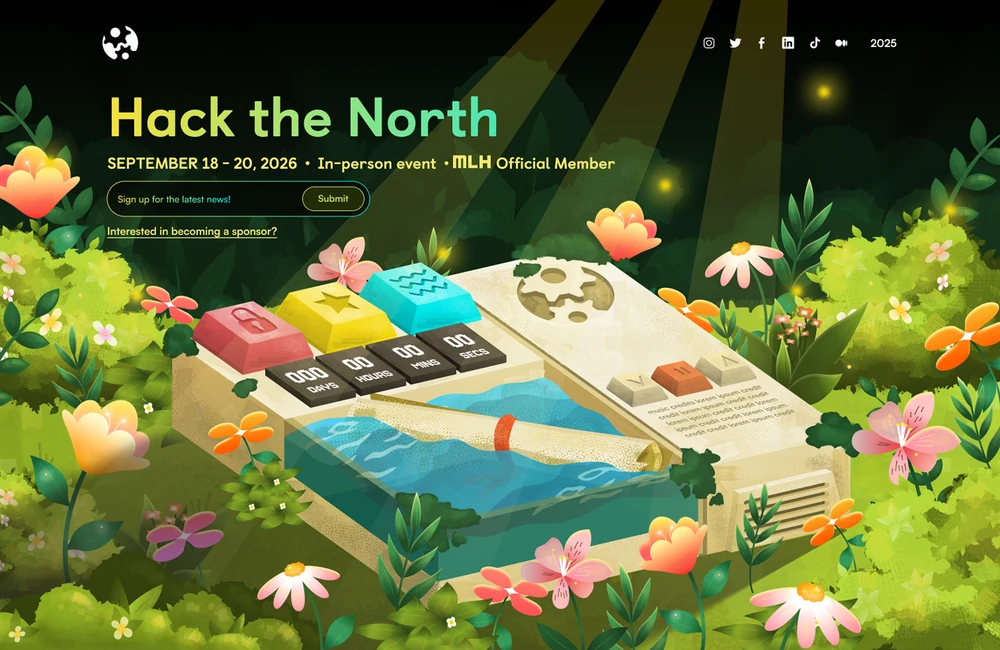
The teaser site was the first digital touchpoint for the 2026 theme. I owned the teaser experience from initial concept and ideation through interaction design and final handoff, exploring how we could reveal the story gradually rather than explaining everything upfront.
The experience was built around one idea:
Let people discover it.
Establishing the visual direction
The teaser also became an early testing ground for the visual language of Hack the North 2026.
I established the overall direction for colour, composition, objects, and interaction, which then helped guide the Graphic Design team as they developed the final visual assets across the broader Hack the North identity.
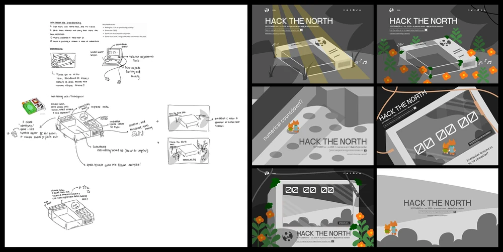
Teaser Site Lo-fi Explorations

Product 02: The Main Site
From teaser to full experience
With the teaser established, the main site became the full expression of the 2026 Hack the North world.
I worked with Jayleen, our other product designer, across the experience to define the sections, objects, interactions, compositions, and behaviors that made the site feel cohesive. We then collaborated with Graphic Designers and Developers to bring those directions to life.
Rather than treating each section as a standalone page component, I wanted the entire site to feel like one connected playground.
Designing the direction, not every pixel
Across these experiences, my role was to define the product and interaction direction: what should exist, where it should live, how it should behave, and how it connected to the rest of the site. I worked closely with our Graphic Designers, who translated these directions into the final illustrations and visual assets.
This collaboration let me focus on the experience architecture while giving the visual team room to push the aesthetic further.
ideationdirectiongraphic design + dev handoff
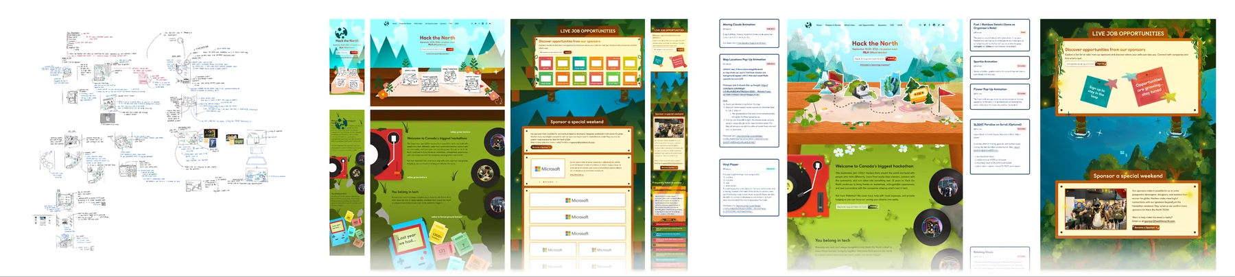
The experiences
The experiences I worked on include:
Product 03: The Design System
Building the system behind the identity
The 2026 site was filled with one-off interactions and expressive visuals, but underneath it all was a shared system. I built and maintained reusable components in Figma to keep the experience consistent across the teaser, static site, and future HTN products.
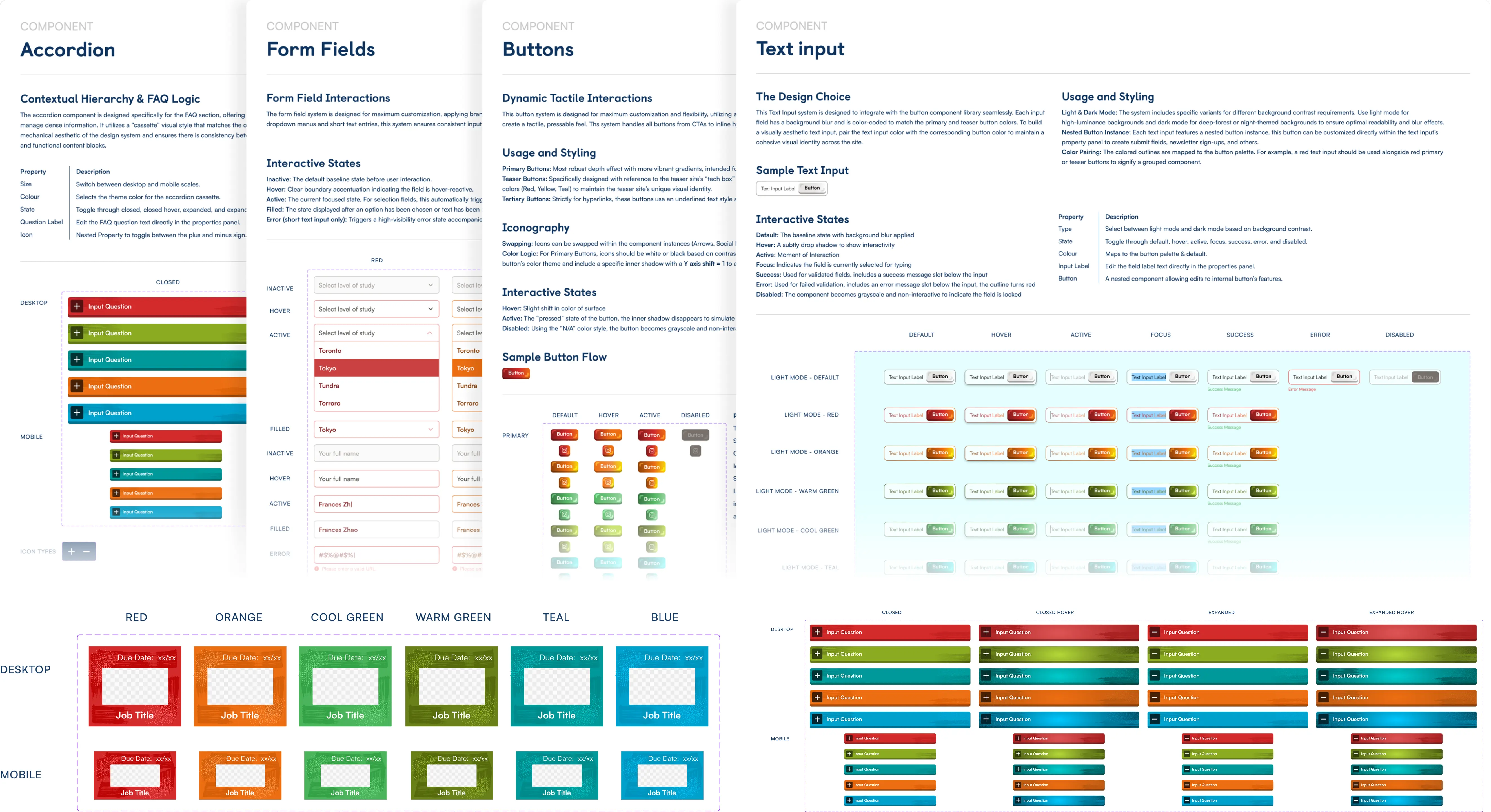
Components I worked on:
- Buttons: States, variants, and interaction behavior.
- Inputs: Reusable fields for forms and applications.
- Accordions: Custom Cassette-design components for FAQ.
- Job postings sticky notes: A scalable structure for different roles and content lengths.
Each component was documented with its states, variants, behaviors, and usage so the system could move cleanly from Figma → development → live site.
Key Takeaways
Designing for discovery
Across the teaser, main site, and design system, I kept coming back to one idea: Give people reasons to explore. Additionally, this project taught me how to turn that idea into something real.
01. Systems make creativity scalable.
This was one of my first opportunities to design within a larger design system, not just creating individual components, but thinking about states, variants, behaviors, and how pieces could work across different experiences. I learned that systems don't have to limit creativity. A strong foundation can actually make room for more of it.
02. Crazy ideas still need structure.
Some of my favorite concepts started as pretty ridiculous ideas. The challenge wasn't coming up with these ideas, that came fairly easily. It was learning how to turn an abstract idea into something another designer or developer could actually build. I got much better at breaking ideas down into interactions, states, flows, compositions, and specifications.
03. The design process is part of the product.
This project taught me to be more comfortable with the messy middle.
Going from ideation → low-fi → direction → high-fi → prototype → handoff wasn't always linear, but each stage answered a different question.
I learned when to keep exploring, when to commit, and how to communicate the why behind a design decision rather than just presenting the final screen.
04. Good design is collaborative.
Working alongside Graphic Designers and Developers taught me that product design isn't about owning every pixel.
My job was often to define what should exist, how it should work, and where it should live, then communicate that direction clearly enough for others to make it even better.
The final experience was stronger because everyone brought a different kind of expertise to the table.